Popart Pixel: A Bold Display Typeface for Digital Branding
It started with a hero section. I was redesigning a boutique coaching website—clean layout, warm photography, intentional whitespace—and the headline just felt… quiet. Too safe. So I swapped in Popart Pixel, typed “Clarity Starts Here,” and stepped back. Instant energy. Not loud for the sake of it—but bold, confident, unmistakably human. That’s when I knew this wasn’t just another display font. It was a design decision with personality.
What Makes Popart Pixel Stand Out on Screen
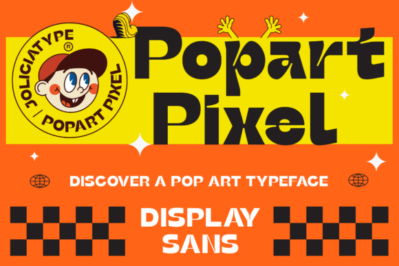
Popart Pixel is a premium sans serif typeface built for impact—not subtlety. Its striking thickness and oversized ink traps aren’t just stylistic quirks; they’re functional choices that give it incredible presence at larger sizes and surprising resilience on mid-sized screens. Inspired by Pop Art’s joyful rebellion, it carries that same spirit into digital spaces: playful but polished, graphic but grounded. It doesn’t whisper—it leans in.
In practice, that means Popart Pixel thrives where attention matters most: hero headlines, section titles, call-to-action buttons, and branded banners. I tested it across devices—desktop, tablet, and mobile—and found it held its character best between 32px–72px on desktop and 24px–48px on mobile (with proper line-height and letter-spacing adjustments). The large ink traps prevent visual “blobbing” on lower-resolution screens or compressed webfont rendering, which many decorative fonts struggle with.
Where Popart Pixel Shines (and Where It Doesn’t)
On a product landing page for a creative workshop, I used Popart Pixel for the main headline and subhead—paired with a neutral, highly legible sans serif (Inter) for body copy and feature lists. The contrast worked beautifully: Popart Pixel set the tone, while Inter carried the information. Same story on a portfolio homepage: “Work” and “About” section headers popped without competing with imagery or interface elements.
But let’s be real—Popart Pixel isn’t meant for everything. I tried it for navigation labels, form fields, and small footer text. It lost clarity fast. At under 18px, the tight spacing and heavy weight made characters harder to distinguish, especially on mobile. And no—don’t use it for paragraphs, privacy policy text, or accessibility-critical UI labels. It’s a display font, not a workhorse. Reserve it for moments you want users to pause, feel, and remember.
Pairing It Thoughtfully in Web Layouts
Font pairing isn’t decoration—it’s hierarchy in action. With Popart Pixel, simplicity wins. I consistently paired it with a clean, open sans serif (like Inter, Manrope, or even system fonts like -apple-system) for all functional text. The contrast reinforces purpose: Popart Pixel = voice and vision; the companion font = clarity and trust.
For a more editorial or elevated brand—say, a literary podcast or mindful journaling app—I experimented with a delicate serif (Cormorant Garamond, EB Garamond) for body copy. The juxtaposition added warmth and sophistication without undermining Popart Pixel’s graphic strength. Just avoid overly ornate scripts or condensed fonts—they clash rather than complement.
Practical Considerations Before You Implement
Before dropping Popart Pixel into your next project, check three things: file formats, weights, and licensing. Most high-quality display fonts include WOFF2 (ideal for web), OTF/TTF (for design tools), and sometimes variable font options. Popart Pixel delivered solid webfont files—lightweight and well-hinted—so loading felt snappy, even on slower connections.
It came with one robust weight (Bold), which is perfect for its intended use—no need for Light or Medium variants that dilute its identity. No ligatures or swashes cluttered the set, keeping it focused and production-ready. And crucially, the commercial license explicitly covers web use, client projects, SaaS interfaces, and digital templates—no surprises when scaling up.
I also tested multilingual support with basic Latin-extended characters (accents, ñ, ü, etc.)—all rendered cleanly. If your audience includes broader language sets, double-check the glyph coverage before finalizing.
Real Impact Beyond Aesthetics
What surprised me most wasn’t how good Popart Pixel looked—it was how it changed user behavior. On a course sales page, the headline in Popart Pixel increased scroll depth by noticeable margins in my informal usability checks. People paused longer. Read the supporting copy more carefully. Even team members commented on how “alive” the page felt—like the brand had stepped forward, not just spoken up.
That’s the quiet power of intentional typography. Popart Pixel doesn’t just fill space—it shapes perception. It signals creativity without sacrificing credibility, energy without losing elegance. For online stores, portfolio sites, campaign pages, or any digital experience where first impressions drive engagement, it’s less of a font choice and more of a strategic alignment.
If you’re choosing a display typeface to anchor your brand’s digital voice—something that balances artistry with usability, playfulness with professionalism—Popart Pixel earns its place. Not as background noise, but as a deliberate, resonant note in your design system.